Adot (Formerly Adotmob)
Adot is a mobile-first cross-device marketing company operating Real Time Bidding advertising campaigns and analysing exclusive online and offline data sources at scale to provide brands with powerful insights on their audiences for a more accurate media activation.
By leveraging its strong data assets, Adot (formerly Adotmob) works for agencies and advertisers by delivering cross-device campaigns using innovative display, native, video and rich media formats.
As the company's first Product Designer I was attached to the development teams. My initial goal was to unify the experience and the UI of existing products and to design new features.

Product organization and ecosystem
Due to the very technical DNA of the company, no design methodology (or designer) was involved before my arrival as product designer. The very rapid growth of the company during its first two years led the developers to implement within a single app (proudly named « Dashboard » …) a very large number of features while the teams were scaling up and started to be more structured.
This monolithic approach has very quickly become a major hindrance to the entire development and design process, making onboarding more complex for newcomers, reducing KPI readability and slowing down scalability.

Goals definition
In order to unify the products and facilitate their evolution, the decision was made to make a break with the monolithic approach and to implement a unified design language: the Adot design system. Splitting the various apps according to the business teams allows to divide the dev teams into several squads. The design system aims to be the tool that will reduce the gap between design and development with three precises goals :

Know your users
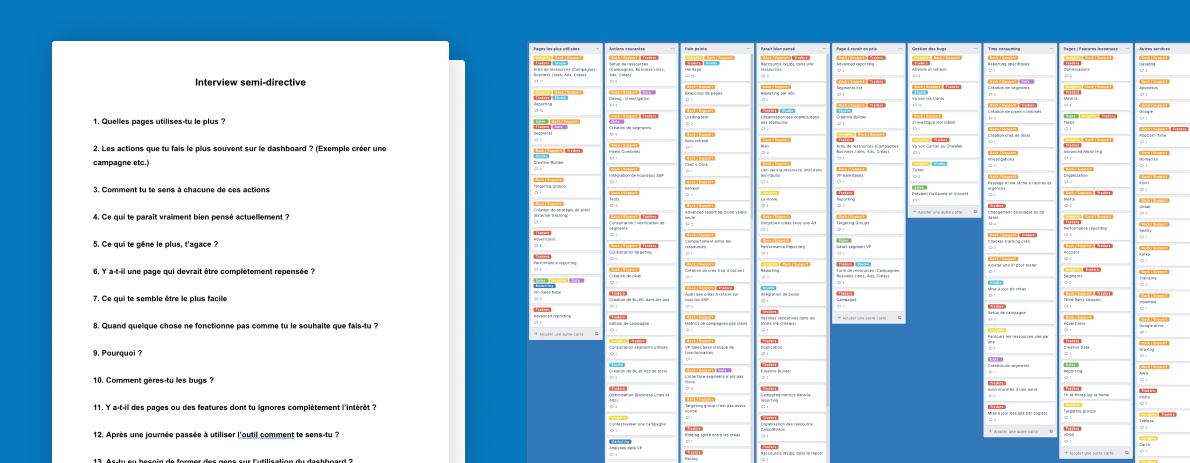
The business objectives of future products are mostly related to optimizing the performance of advertising campaigns, but user needs and pain points have never been clearly defined due to the lack of design methodology before my arrival. Therefore, the first step of this design process was to aggregate the issues that each team encountered both on existing products and in during operational exchanges of informations.
As no analytical tools had been set up beforehand, it was impossible for me to quantitatively measure the prejudice linked to the complexity of the dashboard; this is why I chose to conduct semi-directive user interviews in order to gather as much qualitative feedback as possible. I interviewed about 25 users from various teams (traders, support, developers, insights, marketing etc.) and received a lot of feedback.
What about developers ?
Developers interact with the existing dashboard in three different ways: they are the engineers of this product, the users, and the maintainers. Their user experience can be easily enhanced through the design system. Their experience as technical designers, on the other hand, must necessarily evolve and be unified regardless of the features being developed. Therefore it seemed essential to me to bring a lot of attention to this developer experience in order to transform technical designers into users of the design system. Ensure that Adot Design System will be made by the developers for the developers seemed to be the best way to get on board every front-end developers.
Design approach
Let's face reality: building an entire design system from scratch is a myth that only exists on dribbling shots and a few medium posts, whatever the methodology used, you don't design a car by first defining the size of the wheels. The initial phase of ideation must therefore be the design of a new (or existing) product serving specific use cases. That's why I first had a glimpse of a draft of the new dashboard before starting to think about the components one by one. After several design iterations on a new interface I could finally start defining token, components and so on.

The most suitable design methodology for this kind of project is the Atomic Design methodology, as defined by Brad Frost in 2013. Atomic Design methodology claims to « design systems instead of pages » and perfectly fit the growing needs of modularized interfaces. This methodology is composed of « five distinct stages working together to create interface design systems in a more deliberate and hierarchical manner » : Atoms, Molecules, Organisms, Templates and Pages.
Inventory
To make sure that no functional need is ignored I chose to start by making an inventory of the necessary components in existing products. Due to the nature of its activity, all Adot's services are mainly dashboards and monitoring interfaces, which implies a high level of complexity on forms, inputs and dataviz.
Non-functional elements, the missing particles
Because we need to define variables such as typography, color, shadows or spacing, a supplementary layer is necessary: design token. Token are sharable « subatomic particles » of our design system.
Voice and tone
The words and tone we’ll be using in our interfaces will obviously have an important impact on user experiences. The way we address to the users must be defined.
Design workflow
I chose to start every design step with paper and pen since it’s for me the fastest way to iterate over and over. In 2017 Sketch didn’t have any serious competitor, the Symbols hierarchical system and the libraries files types seemed to be the best solution to setup the foundation of the design system. Sketch app also provide a simple but really efficient prototyping feature that allowed us to quickly mockup user flows and pages. Short animations and interractions were designd via Adobe AfterEffects.
Zeplin was for us the best tool for design handoff, providing usefull auto generated variables and mesuring tools. Since each Adot application is built via React, it seemed obvious to us to build the system design components based on it. Once the functional design was validated, the components were developed individually via Storybook and tested independently. Each validated component was then documented and added to our main documentation static app generated via Gatsby.

Team and contribution
In order to onbard front-end developers and to review technical implementation of our components, Simon (Senior Front-end developer) joined me as a Co-owner of the Design System.
One year after launch, as all other front-end developers (7 people) were assigned to existing product teams, we decided to involve all of them by making each of them a "component referent". Thus each developer became responsible for the maintenance and evolution of one or more components.
Process
We chose to setup a process highly based on the Lean UX methodology with few steps more to ensure Adot•UI guidelines adoption accross teams.

Sketch file structure and Apps custom components
According to Atomic Design recommendations, the Sketch Library file is divided into token, Atom, Molecules and Organisms. Templates and pages exist specifically inside each Apps design files.

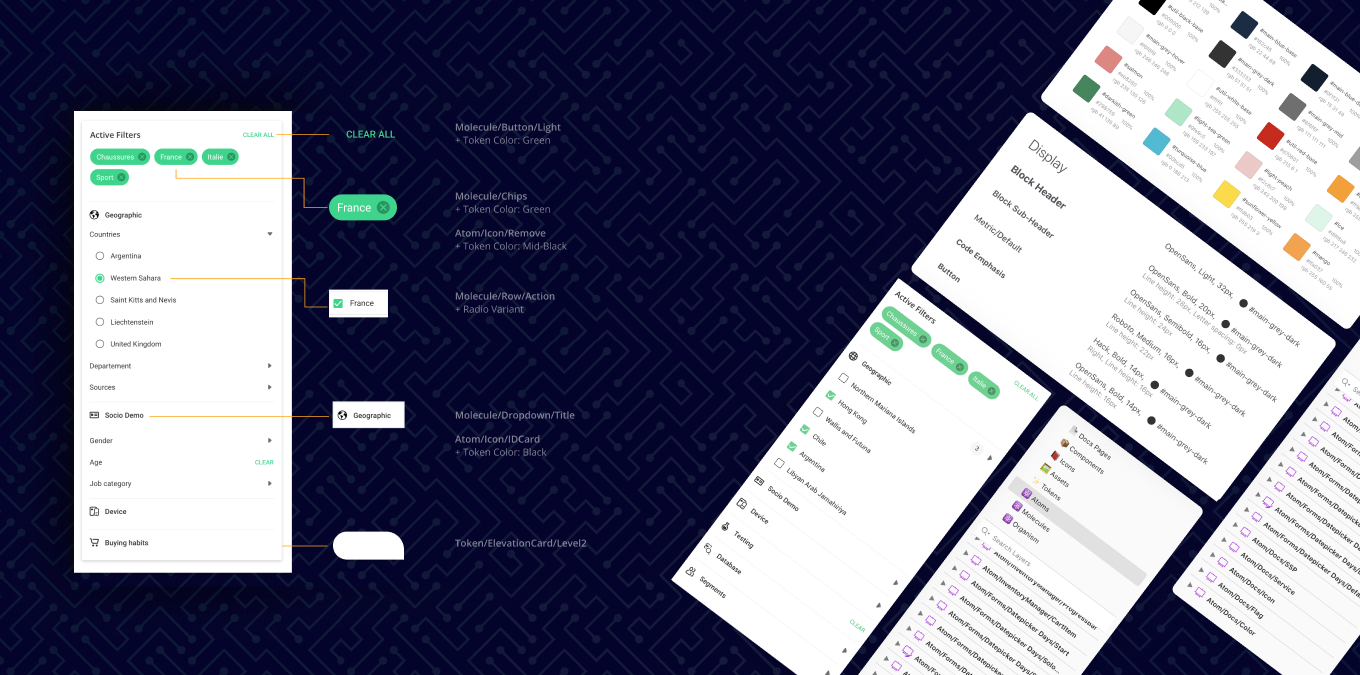
Implementation example
THe inventory manager was one of the many feature-oriented new apps. Inventory manager is a tool that allows project managers to classify, filter and monitor all the advertising inventory used in campaigns. The filters panel (focused bellow) is a great demonstration of components anatomy and design system implementation.

Documentation
The Adot-UI documentation pages provide both informations on technical implementation, props list, a demonstration playground supported by Storybook as well as information on how to use the component according to UX guidelines. Storybook pages are also available independently to facilitate testing and discovery of available behaviors via Knobs.

